|
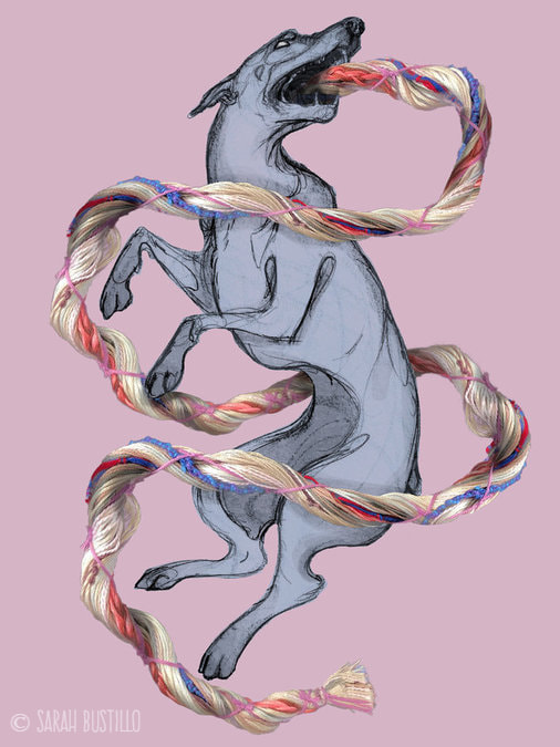
Hello all! This In Depth Process will go over the tools and materials I used to create this piece titled Umbilical. I created this piece as an assignment for one of my illustration courses. The prompt was to incorporate a 3D element, which I'll explain below. MATERIALS:
I first began with the drawing of the dog with graphite on sketch paper. I wanted to keep the sketchy line work in the finished piece because I thought it would nicely mirror the fluid lines in the umbilical cord. Then I scanned the drawing into my computer and isolated the line work in Photoshop. I decided to make my 3D element physically because I was having some issues with the 3D software option. The umbilical cord was created with craft string in several colors. I then positioned the cord how I wanted on a flat surface and took photographs of it with my phone. I sent the pictures to my computer, combined the best ones, and isolated them from the background. Finally, I combined the drawing layer and the cord layer, added some shadows to the cord to look like it was encompassing the dog, and played around with the color palette. Then I was done! I've actually thought about revisiting this piece to see what I can do with it now that I am more fluent in Photoshop than I was at the time of the assignment. If you have any questions about tips and materials please feel free to comment or email me! -Sarah
0 Comments
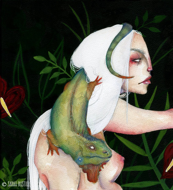
Hello all! For this In Depth Process I will cover the tools and materials I used to make my painting Iguana (Camille). MATERIALS:
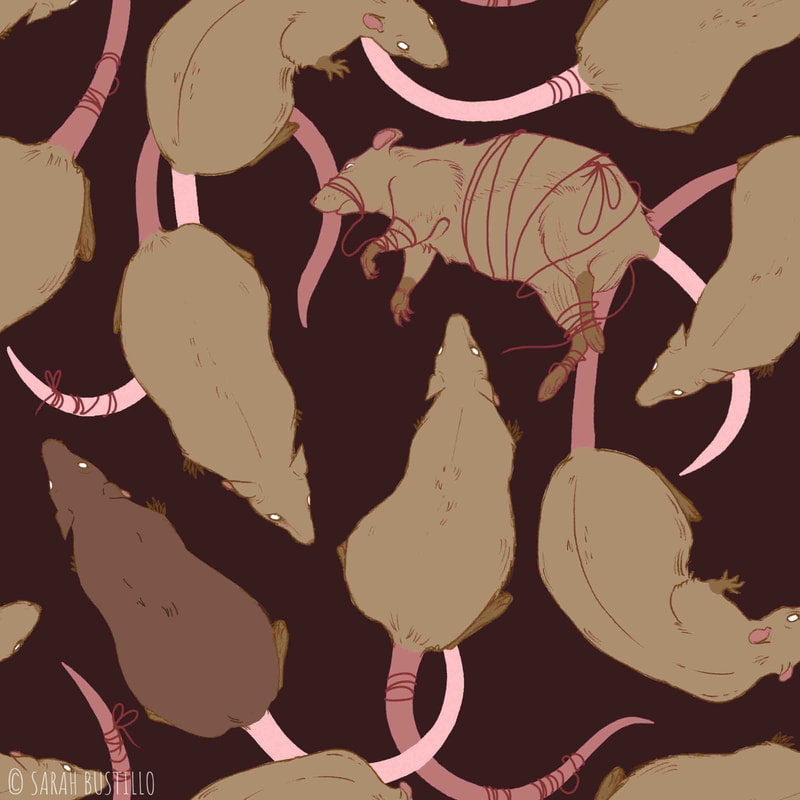
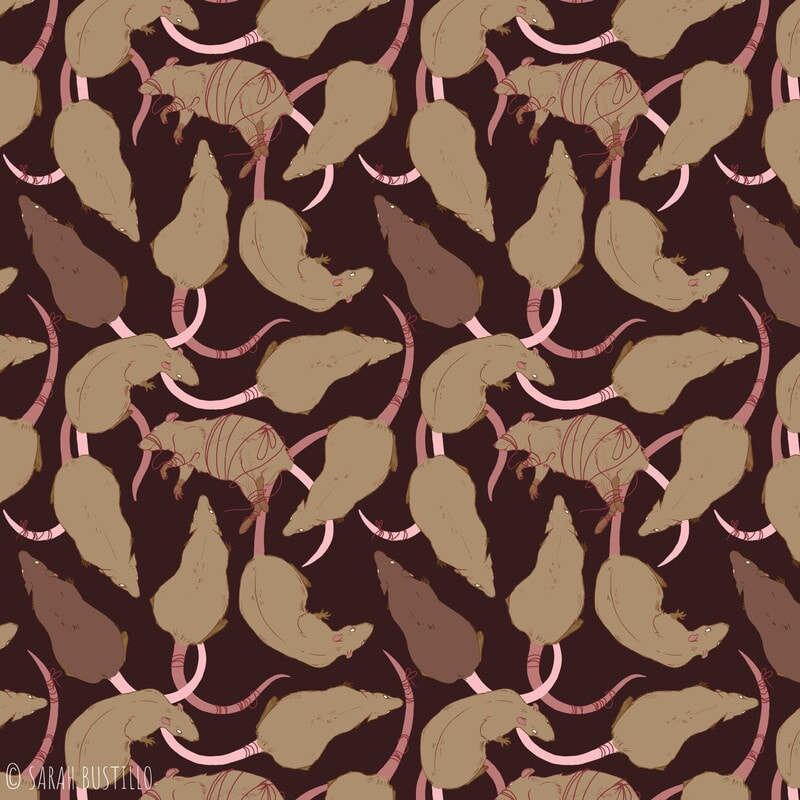
I began this piece with a little less planning than usual. I sketched out the face on a piece of scrap paper and reproduced it on my watercolor paper in pencil. As I continued to sketch out the other elements, I decided that I wanted to incorporate something reptilian as her companion. Because I had already drawn her head and torso, I sketched the iguana to morph around her so no big changes would have to be made. After sketching, I started with watercolor and worked my way outward from her face. After finishing all of the watercolor elements, I outlined everything with India ink pens and waterproof ink for the rest of the background. I then decided to use gouache to add some greenery to the background to give her an environment and to add some more color. As usual, I finished off with highlights and details using my favorite white ink pen. There are areas where my initial pencil sketch is peeking through. I was taught to avoid that when painting, but I do enjoy the look of it sometimes. For that reason, I didn't try to cover it up and instead added even more line work with my pencil. I feel that it helps to define smaller details without the harshness of ink. That's pretty much it for this one. If you have any questions about tips and materials, or for inquiries about purchasing this piece, please feel free to comment or email me! -Sarah Hello all! For this In Depth Process, I am going to go over the tools and materials I used to create my surface design pattern Rats. The process of making it an actual repeating pattern is a bit too long for me to cover here, so I'll mostly be going over the drawing portion. If you're interested in having a tutorial on that however, let me know in the comments below! MATERIALS:
The most difficult part of the process is figuring out how your drawing will line up enough to create a dynamic repeating pattern. However, after that, it's mostly drawing as usual. I began these drawings on paper with graphite pencils. I drew each rat separately so I could place them individually later on in Photoshop. After sketching, I lined the rats with ink pens and scanned them into my computer. In Photoshop, I separated the line work from the white background so I could color the lines any color I want. Again, I did this with each individual rat. Next, I painted in the rats main color under the line work and merged them so the line and paint were on one layer. It was then that I was able to move the individual rats onto one Photoshop file and play around with the positioning. I only drew and scanned in 3 rats total, but I was able to flip some of them around and tweak some details in Photoshop so I had more variety. The last step I did was painting the tails because the placement of those was really reliant on the positioning of the rats' bodies. That is how I painted the initial tile (left image) to create my pattern (right image). Again, if you are interested in a tutorial about the actual making of a pattern in Photoshop, please comment down below. Also, if you have any questions about tips and materials please feel free to comment or email me! -Sarah Hello all! Thank you for visiting my website. This is going to be my second In Depth Process for a landscape painting. I am going to go over the tools and materials I used to create this piece, Untitled Landscape 2. MATERIALS:
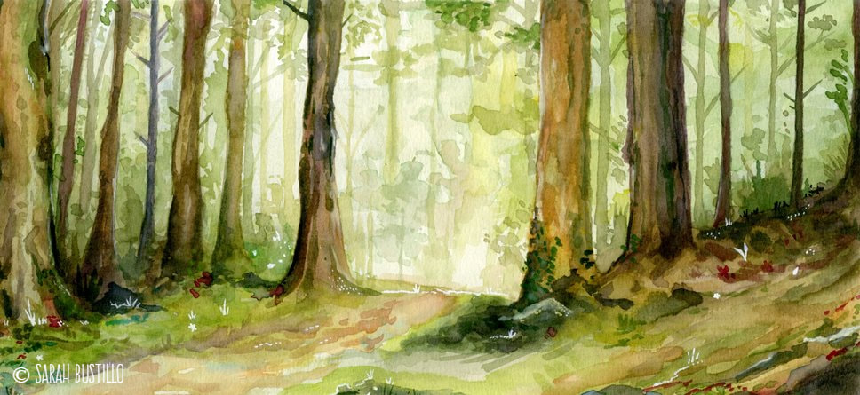
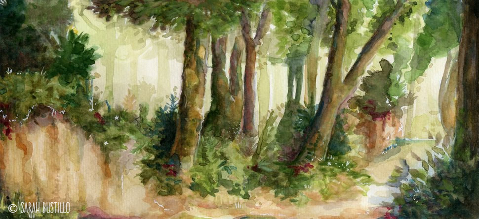
Just like Untitled Landscape 1 this piece measures 7" x 14" and is on Strathmore cold press watercolor paper. I used watercolor for the entirety of the painting, except for some small details that I made with a white ink pen. I put a little more detail into this painting than my previous landscape in terms of the amount of trees in the background. Just as before, I used the wet-on-wet method of watercolor painting and began with very light washes of color. I let the splashes and droplets that sometimes occur with watercolor be what define the shape of the trees. I have mentioned in the past that watercolor is my favorite medium for creating foliage, and that is still the case with this landscape painting. I painted from background to foreground, starting with light washes of color and adding more trees and bushes as I worked my way to the foreground. I find that I have some difficulty making my colors super pigmented especially with watercolor. I wanted darker darks than those that I had in my other landscape (it's all generally very light). For the darkest shadows of the trees I was very heavy handed with browns, blacks, and blues to get the desired darkness I wanted. I think that the execution of this landscape is more successful than the first. As always, I finished off with a white gel pen to add some small details and highlights. That pretty much concludes this IDP! If you have any questions about tips and materials, or for inquiries about purchasing this piece, please feel free to comment or email me! -Sarah Hello all! Thank you for visiting my website. If you're new here, welcome! This blog is where I go more in depth about the materials, techniques, and processes I use when creating my artwork. This IDP will focus on my painting titled Rabbit Heart based on the Florence + the Machine song. This was actually an assignment from one of my illustration courses where we designed album/CD covers. Florence + the Machine is one of my favorite bands, so it just felt right to make one based on them! MATERIALS:
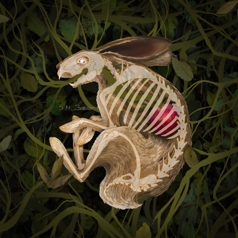
I started this piece with a pencil drawing of the rabbit skeleton. The research portion was pretty difficult because skeleton anatomy is always more intricate and precise than flesh. I then went over my pencil line work with ink pens and scanned it into my computer. In Photoshop, I separated the line work from the background, and began painting the rabbit's body on a different layer. I had to mess around with the opacity of both layers to get them to a point where they didn't seem to clash with each other. On different layers I painted the apple, the color of the rabbit's bones, and the vines. I found a bunch of images of foliage that I could use for reuse with modification, and cut out portions that I liked best and compiled them together to make a large bush for the rabbit to lay in. On top of that I added a vignette and even more vines that I kept flat rather than rendered. Lastly, I played around with the line work for the skeleton because what I had initially picked wasn't standing out nicely. I made my own "gold" line work by mixing two shades of bronze into the one line layer. That's about it! It was definitely a much more exhausting process than those few paragraphs make it sound. Nevertheless, I love the final product! If you have any questions about tips and materials please feel free to comment or email me! -Sarah Hello all! Thank you for visiting my website. If you're new here, welcome! This blog is where I go more in depth about the materials, techniques, and processes I use when creating my artwork. This post will be about my portrait of Elizabeth Short, aka the Black Dahlia. I understand not everyone has an interest in true crime, but if you are interested and are not familiar with her murder I recommend giving it a quick Google search! MATERIALS:
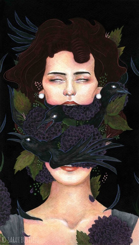
This painting measures 9"x15" and is on cold press watercolor paper. I sketched out everything with graphite, and began painting from her face outward with watercolor. When I was satisfied with the watercolor portion, I outlined everything with an india ink pen and painted the remainder of the background with waterproof india ink. After, I added highlights and detail using my white ink pen to add more interest. Now, I'm going to be honest. I had some issues with value contrast because of how black I wanted this painting to be. One of the reasons that Elizabeth Short was nicknamed the Black Dahlia was because of her black hair. I wanted her hair to be black, but I also wanted the background to be black. This is where I took some creative liberties and added a small amount of brown into her hair. In person, however, the contrast wasn't enough. This is where Photoshop comes in. Again, this is an optional step, but I wanted more contrast for me to consider this complete. So, I lightened up her hair and added a small amount of line work digitally to make it easier to discern her outline. There you have it! That is how I did my Black Dahlia portrait. I have more pieces that have digital elements (or are completely digital) that I will make blog posts about soon. If you have any questions about tips and materials, or for inquiries about purchasing this piece, please feel free to comment or email me! -Sarah
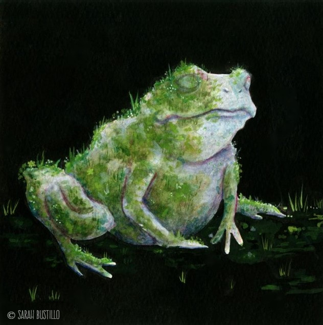
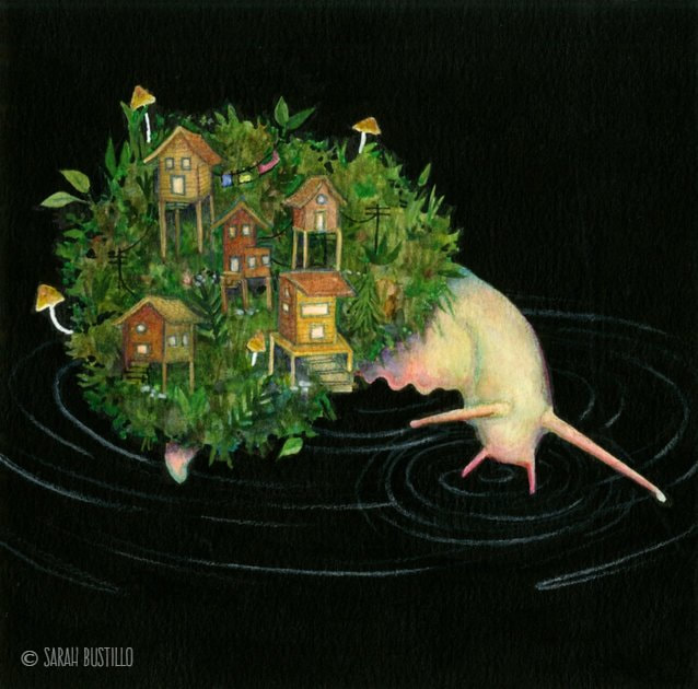
Hello all! Thank you for visiting my website. If you're new here, welcome! This blog is where I go more in depth about the materials, techniques, and processes I use when creating my artwork. I will be combining these three pieces into one post because 1) they are a series and 2) the process and materials are the same for all three. MATERIALS:
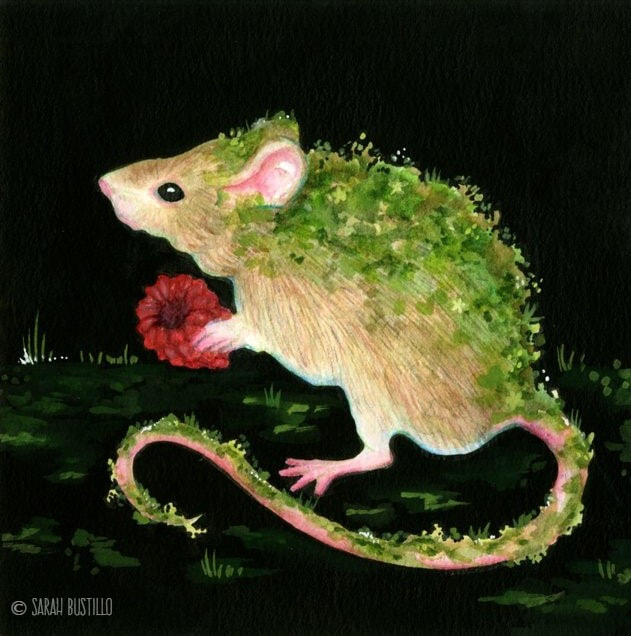
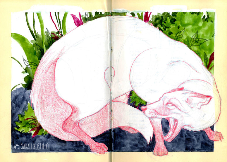
These three pieces measure 7"x 7" and are all done on cold press watercolor paper. The animals were all done in watercolor because, as I've said in previous IDPs, I find it easier to create foliage with. The only exception here might be he snail painting where I wanted more defined leaves as opposed to looser looking moss. For this, I defined the edges with some colored pencils. Just as I did with the painting Decay (Deer) I outlined the animals with an india ink pen and painted the remainder of the background with waterproof india ink. After, I added some texture and detail around the animals with gouache to help ground them. Finally, I ended with some tiny details using my favorite white ink pen to add more interest. That about sums it up for these three! If you have any questions about tips and materials, or for inquiries about purchasing this piece, please feel free to comment or email me! -Sarah Hello all! For this In Depth Process, I am going to go over the tools and materials I used to create the piece, Cower from my Alternative Sketchbook series. For more information about what an Alternative Sketchbook is and how to prepare one, please check out my IDP for Paloma. MATERIALS:
After I prepped the page for painting with gesso and masking tape, I sketched out everything with colored pencil. I cross referenced numerous pictures of foxes and similar animals like dogs, coyotes, and cats, to create a more anatomically correct facial expression and body positioning. I then used a different colored pencil to add some values and define my line work. Next is the fun part: watercolor. Because I primed this page with gesso, watercolor won't absorb into it the same way it does with watercolor paper. Instead, it pools and has to evaporate the way a regular droplet of water would. This creates a really interesting texture that slightly mimics the technique I use for creating foliage in previous works. I suppose "bubbly" might be a good word to describe how it looks. Either way, I love the result! Finally, I added some more graphic and defined leaf shapes in the bushes with another colored pencil. Also, I ended up making the fox larger than I originally had planned, so after removing the masking tape I added the part of the paw and neck that were previously cropped off. That's it! Again, my other In Depth Process for Paloma explains what an Alternative Sketchbook is and how to start one. If you have any questions about tips and materials please feel free to comment or email me! -Sarah
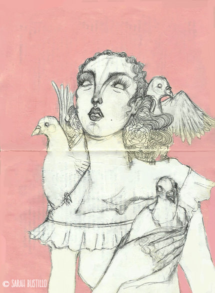
Hello all! For this In Depth Process, I am going to go over the tools and materials I used to create the piece, Paloma. It's actually more of a sketchbook piece, but I still wanted to go over it as I think it has an interesting process that's different from my previous IDPs for Decay (Deer) and Untitled Landscape 1. MATERIALS:
This piece is actually a lot different than my previous pieces because it is an Alternative Sketchbook page. An Alternative Sketchbook is a sketchbook made from an old book that you can paint over, tear apart, and generally experiment with. The used book I had was an old copy of Hamlet. In order to make the book your own, it's nice to cover the text so it doesn't overpower your artwork (though I like how it looks when the words slightly peek through). I started by covering the page in white gesso, but white acrylic paint works well too. It did require a few coats to cover most of the text. Then I began sketching with graphite (I'm not partial to any one brand, I just used an office mechanical pencil I had lying around). Then, I finished by painting the background with one of my favorite tubes of acrylic paint. And there you have it, a finished Alternative Sketchbook spread. I would recommend spraying it with some spray fixative if you use graphite so parts don't smudge like mine did (I don't mind it though). Also, if the pages of the book you choose seem too thin to hold gesso or paint, glue some pages together like I did to make them stronger. If you have any questions about tips and materials please feel free to comment or email me! -Sarah
Hello all! Thank you for visiting my website. So just like I did last time with my painting Decay (Deer), I am going to go over the tools and materials I used to create this piece, Untitled Landscape 1. MATERIALS:
This piece measures 7" x 14" and is on Strathmore cold press watercolor paper. I used watercolor for the entirety of the painting, except for some small details that I made with a white ink pen. I used the wet-on-wet method of watercolor painting, which is when you put the pigment down on an already damp surface. This really helps me with the environmental perspective as well because it allows for even lighter washes of color and a less defined shape. I have mentioned before that watercolor is my favorite medium for creating foliage, and that is still the case with this landscape painting. It's easy to build pigment, and the puddles that the water creates give the illusion of shadows. I painted from background to foreground, starting with light washes of color and adding more trees and bushes as I worked my way to the foreground. As mentioned earlier, I finished off with a white gel pen to add some small details. That's pretty much it for this one! If you have any questions about tips and materials, or for inquiries about purchasing this piece, please feel free to comment or email me! -Sarah |
AuthorSarah Bustillo is an illustrator from Los Angeles, CA. Her work delves into themes of femininity, death, and rebirth. She graduated from California State University Northridge in 2018 with a degree in Illustration and Anthropology. Archives
May 2020
Categories |
 RSS Feed
