|
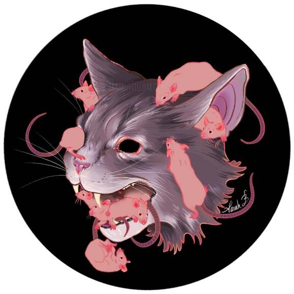
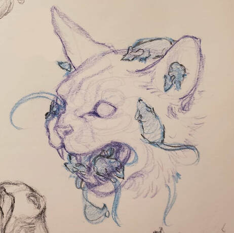
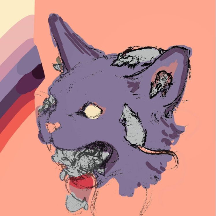
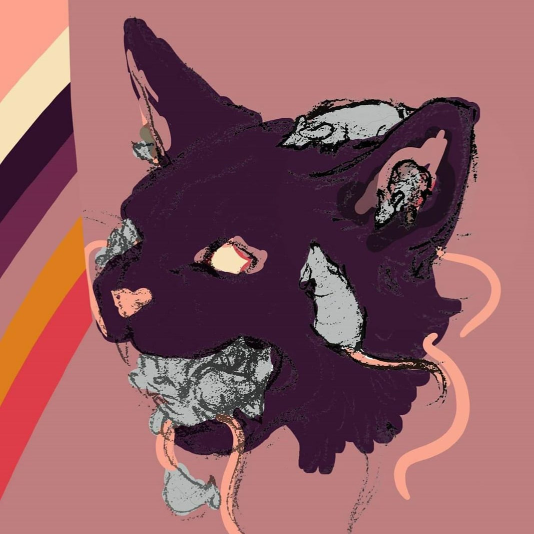
Hello all! This In Depth Process will go over my creative and technical process for creating this piece titled Absolution. I will provide pictures of my process and try to cover each step as best I can. Just like last time, I used the Procreate app on my 12.9” iPad pro. I have done digital art before but primarily on Photoshop, so I am still learning how to use Procreate to get the results I want. It’s a lot of trial and error. This piece technically took me months to do. I sketched it back in September of last year for a project that fell through, but I made sure to keep the sketch. At the time, I was having a lot of problems with how I wanted to execute this piece. I was traveling and didn't have the best environment and tools for digital art. I really only had watercolors and ink, and although I love those mediums, they wouldn’t have worked for this piece in my opinion. I was also having a bit of an identity crisis (it’s still ongoing, but not as bad) about my subject matter and use of color. I’ve always loved pastels and more unnatural colors in other artist’s work, but I never really used them myself. I was worried that using colors that were different from my usual would turn off some of my followers. It’s a fear that really shouldn’t matter since an artist should be allowed to create whatever they want, but unfortunately it’s a very real concern. I played around with some colors that I really like and tried my best to recreate them traditionally with watercolors. It didn’t work. It was actually a tremendous waste of paper and paint. Maybe it could’ve worked with gouache, but my paints were far too translucent. So I scrapped the idea altogether. Now in 2020 (and practicing social distancing ☺) I thought I’d give this piece another try. I imported the photo of my sketch into Procreate and cleaned up the linework on a new layer. I locked that layer (“alpha lock” on Procreate) so that I could change the color of the linework later on. On a new layer, below the linework, I started blocking my colors with a soft round brush. I actually started out painting the cat in a more natural grey color instead of purple (hello identity crisis), but I’ll explain how it becomes purple later on. I blocked in the lightest and darkest areas of the fur and then zoomed in and added strokes to resemble the direction that fur grows. I alternated between shades and made sure to overlap areas with different tones to give the effect of fur. I wanted the rats to stand out from the cat so I opted to not render their fur at all. I figured their general shape makes them recognizable as rats already. I painted them one solid pink color, but I decided to go in and add some highlights and details to the ears, noses, eyes, and feet. Afterward I added similar details to the cat’s eyes and nose. I was essentially done with the piece, but I still wanted to play around with the colors because I couldn’t let go of the image I had in my head of this piece back in 2019. I really wanted to try some different colors and when I looked at my old thumbnails I decided to colordrop those exact colors and try again here (see below for those thumbnails). Eventually I made an overlay layer with a lilac color. This is a technique that I still can’t get right the first time. Like I said before it’s a lot of trial and error, but I ended up liking how the overlay looked. Then I struggled with the color of the linework. I went back to that locked line layer and tried several different color options and none of them seemed “right”. I narrowed it down to some colors that could work, but ended up using all of them. Literally. I painted the lines all hot pink first, then quickly and messily scribbled in other colors like a pale yellow, pale orange, baby pink, and burnt umber. That variation is what gives the piece a slight neon quality which I really like. It seems very deliberate, but it's actually very chaotic. At one point it was a little too chaotic, so I calmed it down by making the linework of the rats mostly in pink, so the crazy color variations were only on the cat’s linework. And there we have it! A step by step process for creating this piece. I hope you all are starting to realize just how much of my artwork is the result of trial and error. Mostly error, and then trying to hide that error without having to start all over. Regardless I’m happy I was finally able to finish this piece and I can stop having nightmares about my abandoned sketch. I hope that this was helpful in some way and if you have any questions about tips and materials please feel free to comment or email me! -Sarah
0 Comments
Leave a Reply. |
AuthorSarah Bustillo is an illustrator from Los Angeles, CA. Her work delves into themes of femininity, death, and rebirth. She graduated from California State University Northridge in 2018 with a degree in Illustration and Anthropology. Archives
May 2020
Categories |


 RSS Feed
