|
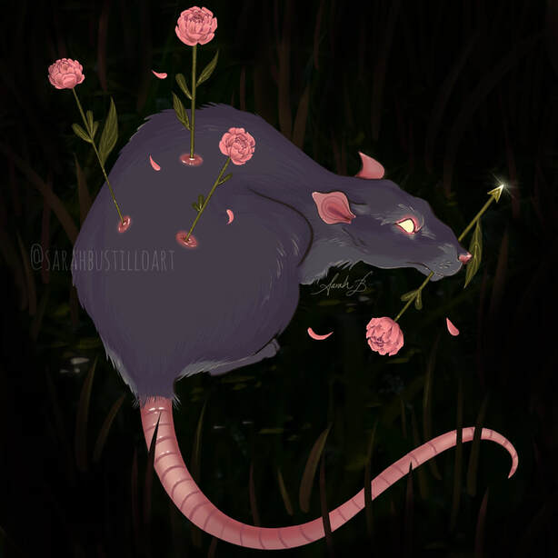
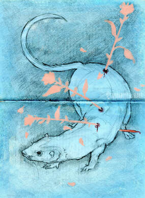
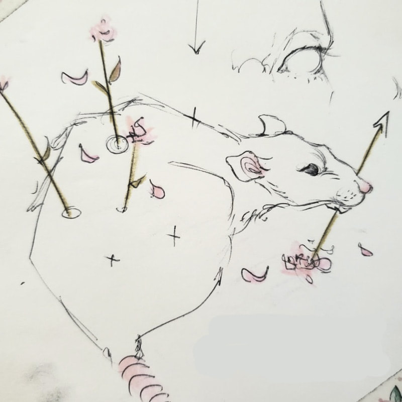
Hello!!!!!! I’ve been away from the art world for a little bit, but I’m back and excited to get some work done. I posted my first post since November 2019 just a few weeks ago on my instagram (@SarahBustilloArt) and the response made me even more excited to share some new pieces. Um, but what new pieces? That’s the next hurdle. A friend of mine (@krisspyart on instagram, go give her a follow) let me borrow her ipad so I could try out Procreate and let me just say that it’s lovely! Since then I have been able to get my own ipad and Procreate program as well. Since my background in digital art is primarily with Photoshop, getting used to Procreate took a bit of time. In general it works exactly the same way with layers, brushes, and overlays. It feels different, but a good kind of different. Just as before with my previous posts I’ll be going over my creative and technical process, however this time the piece I will be referencing will be an entirely digital piece. It’s actually one that I had originally intended to be a warm up/messy sketch. Don’t you hate when that happens? The sketches decide they want to be full pieces, but you don’t realize this until you’ve spent nearly 2 hours working on it! (*groans*) As I stated before, I used Procreate for this painting and the default brushes that come with the program as well. I have yet to venture into downloading new brushes only because I felt that the default brushes work just fine for me at the moment). I don’t think it’s any surprise how much I love drawing rats. And flowers. And wounds in some way, shape, or form. The concept of arrow-like flowers piercing an animal is something I’ve doodled numerous times before, but I think the first time I did a more “finished” piece with that layout was in a sketchbook assignment back in college, which I've attached below on the left. The image on the right is the original sketch that I took a picture of on my phone and transferred into Procreate. On a 12x12” canvas (just to be safe) at 300 dpi, I opened a new layer and basically traced over my sketch. Typically when I used Photoshop and made pieces that I intended to be real finished portfolio pieces (remember, this was supposed to just be a messy practice drawing)-- I would scan the pencil sketch or linework, transfer it to Photoshop and then separate the linework from the background to use in my piece. Yeah, I didn’t do that this time. Instead I traced over my sketch and made that layer just the linework. I locked that line layer (a feature called “alpha lock” on Procreate) so I could go back and change the color of the linework whenever I want. On a new layer underneath the linework I begin painting with a basic shape to fill in the rat. Just one flat, solid color. Then on a new layer is when I add the details.
I came across a challenge that I’ve actually faced numerous times before (and have yet to learn from apparently). I draw a lot of animals, a lot of which are furry. So, I have a hard time finding the sweet spot for how much or how little to render fur. Sometimes I go 110% and render every single hair, and it looks great in the end, but I feel like a corpse afterward because it takes so long to do. I’ve also done some versions where there’s basically no rendering at all, but there's an implication of fur with one or two little lines. With this piece, I finally tried to get my footing and figure out what my “sweet spot” is. This is still a work in progress, but I think I may have found it. I used about three shades of the fur color, the shadow, the midtone, and the highlight, and tried to stick to these three colors exclusively when making the majority of the fur. It’s an effect that I’ve always liked seeing when I look at other artists' work, but I didn’t execute it too well this time. In retrospect, there’s not enough contrast with the three colors I chose. I’ll have to play around with this and get more comfortable with the concept of "less is more". After the fur, I moved on to the flowers which were relatively easy. I had a hard time figuring out what kind of flowers I wanted them to be though. They ended up being the strange love children of a peony and a rose. Next, I put in details on the rat by adding a slight glow to the eyes and some details around the eyes, ears, nose, and wounds. Lastly, I added a few highlights to the fur and gave my little rat an environment. I drew some grass and pebbles in the background, decided I hated it, and put a big ol’ vignette to cover them up instead. How classy of me. Again, there are some things that I would change about this, and it’s by no means anything portfolio-worthy, but I still enjoyed the process and like how this piece came out. I know this post was a bit long, but I wanted to catch up with you all and go into a little bit more of the specifics of the process. I will probably be doing a lot of digital art in the next few weeks because I can’t really go out and buy supplies right now (please stay home, everyone), but also because I’m thoroughly enjoying playing around with Procreate. I hope that this was helpful in some way and if you have any questions about tips and materials please feel free to comment or email me! -Sarah
0 Comments
Leave a Reply. |
AuthorSarah Bustillo is an illustrator from Los Angeles, CA. Her work delves into themes of femininity, death, and rebirth. She graduated from California State University Northridge in 2018 with a degree in Illustration and Anthropology. Archives
May 2020
Categories |


 RSS Feed
