|
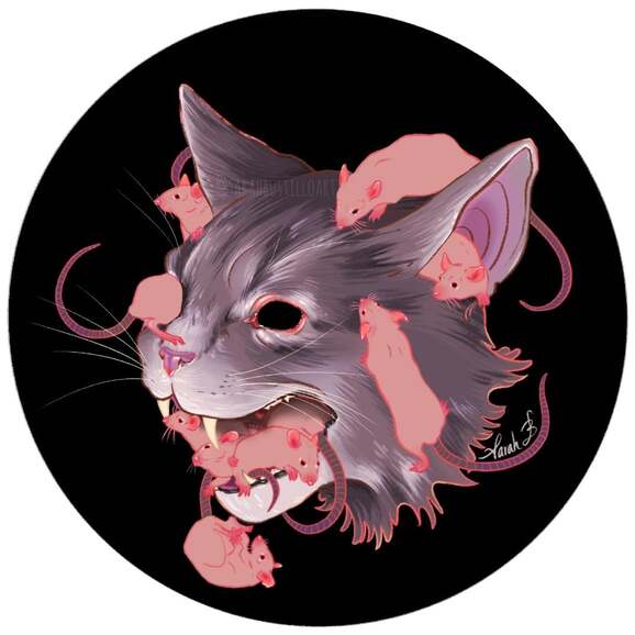
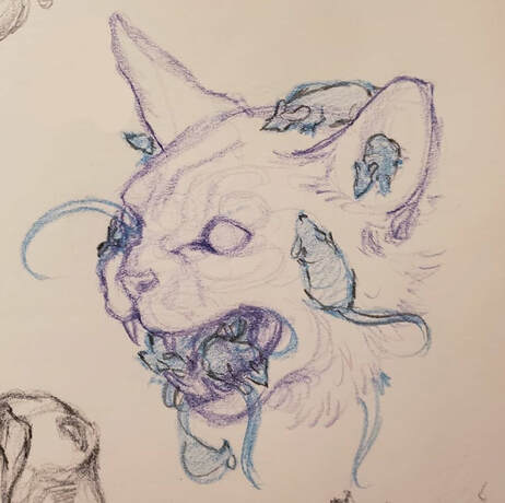
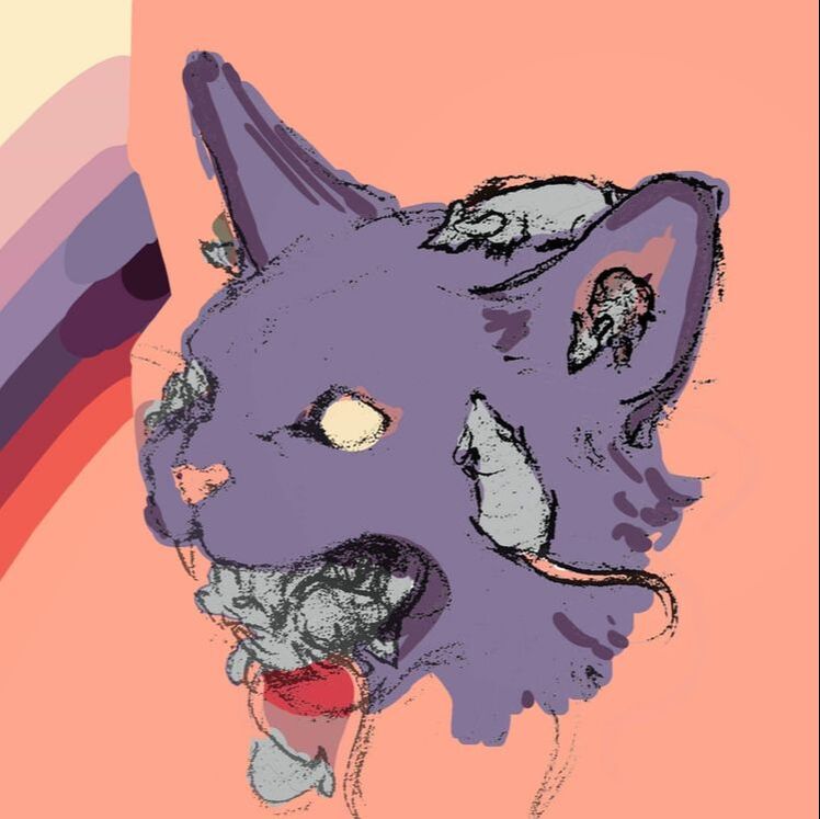
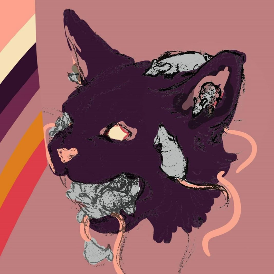
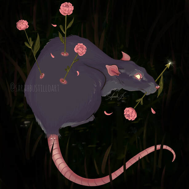
Hello all! This In Depth Process will go over my creative and technical process for creating this piece titled Absolution. I will provide pictures of my process and try to cover each step as best I can. Just like last time, I used the Procreate app on my 12.9” iPad pro. I have done digital art before but primarily on Photoshop, so I am still learning how to use Procreate to get the results I want. It’s a lot of trial and error. This piece technically took me months to do. I sketched it back in September of last year for a project that fell through, but I made sure to keep the sketch. At the time, I was having a lot of problems with how I wanted to execute this piece. I was traveling and didn't have the best environment and tools for digital art. I really only had watercolors and ink, and although I love those mediums, they wouldn’t have worked for this piece in my opinion. I was also having a bit of an identity crisis (it’s still ongoing, but not as bad) about my subject matter and use of color. I’ve always loved pastels and more unnatural colors in other artist’s work, but I never really used them myself. I was worried that using colors that were different from my usual would turn off some of my followers. It’s a fear that really shouldn’t matter since an artist should be allowed to create whatever they want, but unfortunately it’s a very real concern. I played around with some colors that I really like and tried my best to recreate them traditionally with watercolors. It didn’t work. It was actually a tremendous waste of paper and paint. Maybe it could’ve worked with gouache, but my paints were far too translucent. So I scrapped the idea altogether. Now in 2020 (and practicing social distancing ☺) I thought I’d give this piece another try. I imported the photo of my sketch into Procreate and cleaned up the linework on a new layer. I locked that layer (“alpha lock” on Procreate) so that I could change the color of the linework later on. On a new layer, below the linework, I started blocking my colors with a soft round brush. I actually started out painting the cat in a more natural grey color instead of purple (hello identity crisis), but I’ll explain how it becomes purple later on. I blocked in the lightest and darkest areas of the fur and then zoomed in and added strokes to resemble the direction that fur grows. I alternated between shades and made sure to overlap areas with different tones to give the effect of fur. I wanted the rats to stand out from the cat so I opted to not render their fur at all. I figured their general shape makes them recognizable as rats already. I painted them one solid pink color, but I decided to go in and add some highlights and details to the ears, noses, eyes, and feet. Afterward I added similar details to the cat’s eyes and nose. I was essentially done with the piece, but I still wanted to play around with the colors because I couldn’t let go of the image I had in my head of this piece back in 2019. I really wanted to try some different colors and when I looked at my old thumbnails I decided to colordrop those exact colors and try again here (see below for those thumbnails). Eventually I made an overlay layer with a lilac color. This is a technique that I still can’t get right the first time. Like I said before it’s a lot of trial and error, but I ended up liking how the overlay looked. Then I struggled with the color of the linework. I went back to that locked line layer and tried several different color options and none of them seemed “right”. I narrowed it down to some colors that could work, but ended up using all of them. Literally. I painted the lines all hot pink first, then quickly and messily scribbled in other colors like a pale yellow, pale orange, baby pink, and burnt umber. That variation is what gives the piece a slight neon quality which I really like. It seems very deliberate, but it's actually very chaotic. At one point it was a little too chaotic, so I calmed it down by making the linework of the rats mostly in pink, so the crazy color variations were only on the cat’s linework. And there we have it! A step by step process for creating this piece. I hope you all are starting to realize just how much of my artwork is the result of trial and error. Mostly error, and then trying to hide that error without having to start all over. Regardless I’m happy I was finally able to finish this piece and I can stop having nightmares about my abandoned sketch. I hope that this was helpful in some way and if you have any questions about tips and materials please feel free to comment or email me! -Sarah
0 Comments
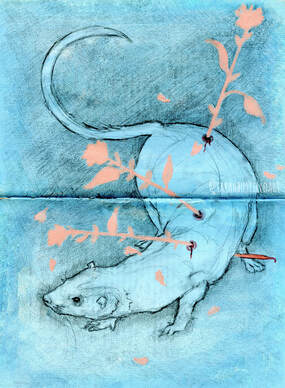
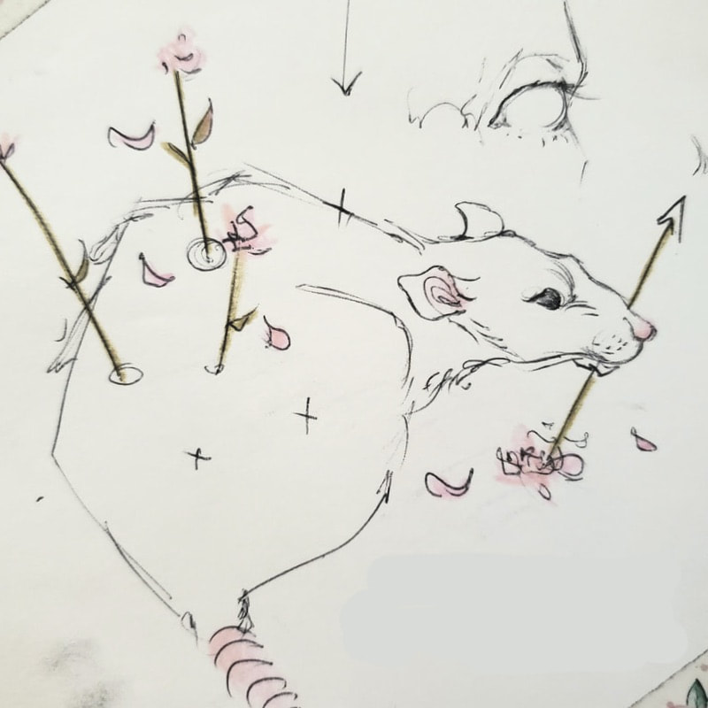
Hello!!!!!! I’ve been away from the art world for a little bit, but I’m back and excited to get some work done. I posted my first post since November 2019 just a few weeks ago on my instagram (@SarahBustilloArt) and the response made me even more excited to share some new pieces. Um, but what new pieces? That’s the next hurdle. A friend of mine (@krisspyart on instagram, go give her a follow) let me borrow her ipad so I could try out Procreate and let me just say that it’s lovely! Since then I have been able to get my own ipad and Procreate program as well. Since my background in digital art is primarily with Photoshop, getting used to Procreate took a bit of time. In general it works exactly the same way with layers, brushes, and overlays. It feels different, but a good kind of different. Just as before with my previous posts I’ll be going over my creative and technical process, however this time the piece I will be referencing will be an entirely digital piece. It’s actually one that I had originally intended to be a warm up/messy sketch. Don’t you hate when that happens? The sketches decide they want to be full pieces, but you don’t realize this until you’ve spent nearly 2 hours working on it! (*groans*) As I stated before, I used Procreate for this painting and the default brushes that come with the program as well. I have yet to venture into downloading new brushes only because I felt that the default brushes work just fine for me at the moment). I don’t think it’s any surprise how much I love drawing rats. And flowers. And wounds in some way, shape, or form. The concept of arrow-like flowers piercing an animal is something I’ve doodled numerous times before, but I think the first time I did a more “finished” piece with that layout was in a sketchbook assignment back in college, which I've attached below on the left. The image on the right is the original sketch that I took a picture of on my phone and transferred into Procreate. On a 12x12” canvas (just to be safe) at 300 dpi, I opened a new layer and basically traced over my sketch. Typically when I used Photoshop and made pieces that I intended to be real finished portfolio pieces (remember, this was supposed to just be a messy practice drawing)-- I would scan the pencil sketch or linework, transfer it to Photoshop and then separate the linework from the background to use in my piece. Yeah, I didn’t do that this time. Instead I traced over my sketch and made that layer just the linework. I locked that line layer (a feature called “alpha lock” on Procreate) so I could go back and change the color of the linework whenever I want. On a new layer underneath the linework I begin painting with a basic shape to fill in the rat. Just one flat, solid color. Then on a new layer is when I add the details.
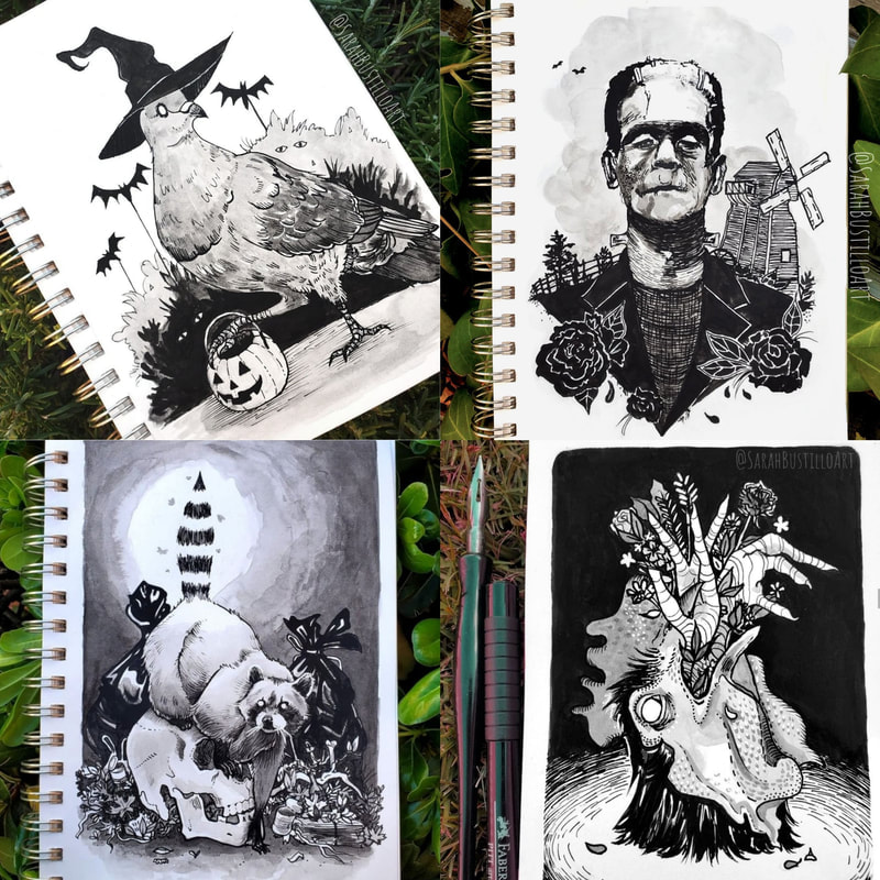
I came across a challenge that I’ve actually faced numerous times before (and have yet to learn from apparently). I draw a lot of animals, a lot of which are furry. So, I have a hard time finding the sweet spot for how much or how little to render fur. Sometimes I go 110% and render every single hair, and it looks great in the end, but I feel like a corpse afterward because it takes so long to do. I’ve also done some versions where there’s basically no rendering at all, but there's an implication of fur with one or two little lines. With this piece, I finally tried to get my footing and figure out what my “sweet spot” is. This is still a work in progress, but I think I may have found it. I used about three shades of the fur color, the shadow, the midtone, and the highlight, and tried to stick to these three colors exclusively when making the majority of the fur. It’s an effect that I’ve always liked seeing when I look at other artists' work, but I didn’t execute it too well this time. In retrospect, there’s not enough contrast with the three colors I chose. I’ll have to play around with this and get more comfortable with the concept of "less is more". After the fur, I moved on to the flowers which were relatively easy. I had a hard time figuring out what kind of flowers I wanted them to be though. They ended up being the strange love children of a peony and a rose. Next, I put in details on the rat by adding a slight glow to the eyes and some details around the eyes, ears, nose, and wounds. Lastly, I added a few highlights to the fur and gave my little rat an environment. I drew some grass and pebbles in the background, decided I hated it, and put a big ol’ vignette to cover them up instead. How classy of me. Again, there are some things that I would change about this, and it’s by no means anything portfolio-worthy, but I still enjoyed the process and like how this piece came out. I know this post was a bit long, but I wanted to catch up with you all and go into a little bit more of the specifics of the process. I will probably be doing a lot of digital art in the next few weeks because I can’t really go out and buy supplies right now (please stay home, everyone), but also because I’m thoroughly enjoying playing around with Procreate. I hope that this was helpful in some way and if you have any questions about tips and materials please feel free to comment or email me! -Sarah Hello all!! This past October I participated in my first ever Inktober on my instagram (@SarahBustilloArt). For those who aren't aware, Inktober is a drawing challenge created by Jake Parker that takes place every October. The goal is to create art everyday for 31 days using ink, though many artists use different mediums if they want. There's an official prompt you can follow, but many artists make their own prompts or don't follow a prompt at all (which is what I did). With that said, today's In Depth Process will focus on my month long journey through my first Inktober. I'll go over the materials I used and talk about some of my original drawings as well. MATERIALS:
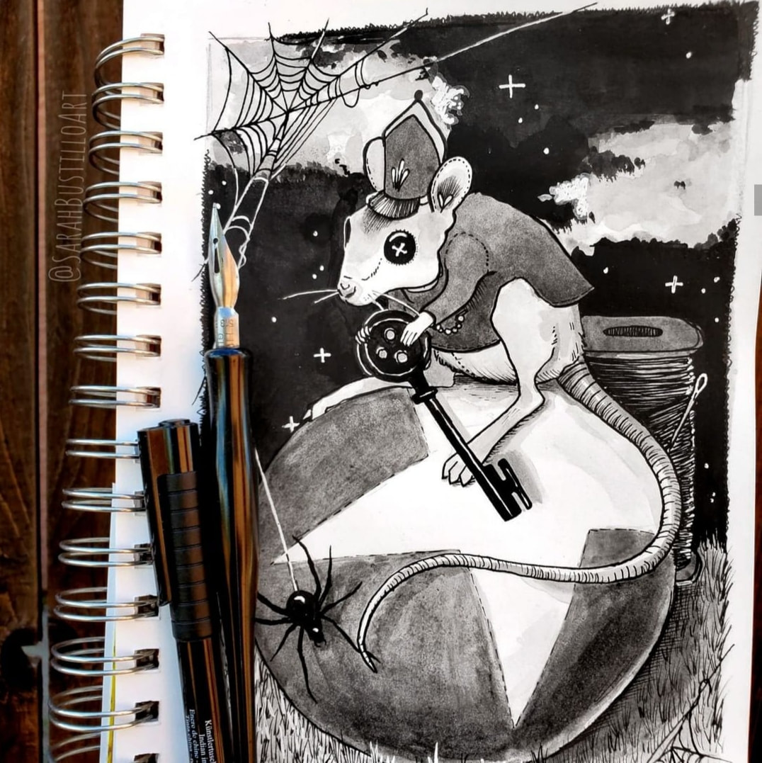
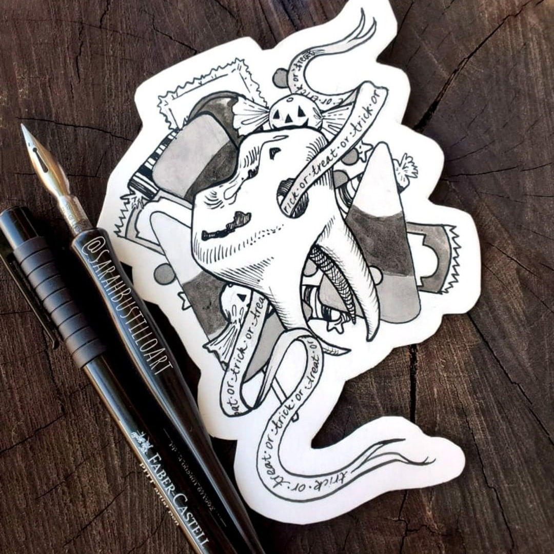
I knew I didn't want to follow a prompt for Inktober, but I made sure to plan out a few sketches before October began so that I had somewhere to start. That definitely helped get rid of some of the anxiety because some days are harder to be creative than others. I also got a lot of comments on my Instagram asking how I was able to make detailed pieces each day. The answer is simple: restless limb syndrome. I just don't sleep well, so a lot of the time I found myself starting a drawing for the next day the night before. It's not fun, but you gotta do what you gotta do! After deciding on a general concept, I sketched out my drawings in my Strathmore 5.5 x 8.5 sketchbook and inked with Dr. Ph Martin's india ink. The Speedball 513EF pen nib was my primary weapon for inking, though I used my dying Faber-Castell PITT pens for some super fine lines. If I decided to use a wash, I would mix 1 drop of ink with about 6 or more drops of water to create a nice grey. For white details that I didn't plan ahead for, I used my favorite white gel pen. Decision making isn't really a strength of mine, so I improvised a lot and learned how to get creative with some of my mistakes. For example, the drawing above from Day 3 wasn't a very good composition in my sketchbook, so I cut it out and now it looks more successful as a sticker. I also learned that splitting my pages in half made it easier for me to come up with compositions that weren't complex scenes. As the days progressed, many of my drawings became smaller, but more detailed. The circus mouse drawing at the top of the page is a good example of all the different techniques I used during Inktober. I knew I wanted to create a piece inspired by the movie Coraline, and the circus mice felt right up my alley. I worked from foreground to background starting with inking all the line work. I then filled in the larger areas of black with ink and an old paintbrush. To add more dimension to the ball, I used numerous washes of ink to get my desired shading. Some remaining areas (mostly the star on the ball and the clouds) were a bit too white, so I dulled them down slightly with the inky water I was using to clean my brush. I finished the whole thing off with some white ink details for the stars, webs, and highlights. I used the same basic process for most of my drawings, including the ones below. I had been wanting to do Inktober ever since I learned about it years ago, but I never really had the time or confidence. If I started, I knew I would give up by around Day 8 or so. I expected this to be a great learning experience and it really was! I discovered that I like ink a lot more than I thought and I'm much better at controlling my lines now. It has also helped to strengthen my knowledge of value and composition.
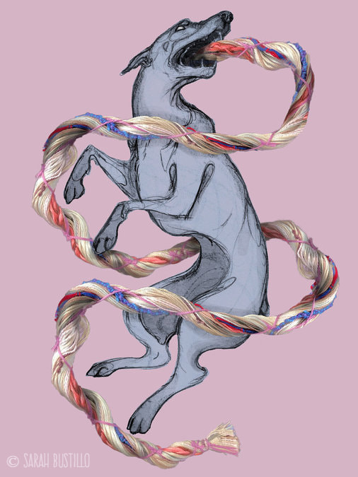
I especially liked that Inktober gave me the ability to break away from what some people expect me to draw and create whatever I want. At one point in my career I felt "stuck" doing portraits, then when I moved to animals I felt like everyone expected more whimsical or thoughtful pieces from me. That feels very restricting! So doing Inktober was a good excuse to draw some things that I had been keeping myself from drawing for a bit. It's also given me a few ideas of some pieces I'd like to create in the future! I'm hoping to do something with the pieces I've made this year, either as prints or a zine. That, however, will have to wait until after I buy a new computer. I'm entirely phone-bound at the moment, and writing a blog post on your phone is very hard on the thumbs. . . but I digress. So if you're an artist that recently completed (or even attempted) Inktober this year, congratulations! If you're considering Inktober next year, I wish you luck and I'd love to see what you come up with. If this was in any way helpful, please let me know in the comments below or tag me in some of your Inktober creations on Instagram (@SarahBustilloArt) so I can see them! -Sarah Hello all! This In Depth Process will go over the tools and materials I used to create this piece titled Umbilical. I created this piece as an assignment for one of my illustration courses. The prompt was to incorporate a 3D element, which I'll explain below. MATERIALS:
I first began with the drawing of the dog with graphite on sketch paper. I wanted to keep the sketchy line work in the finished piece because I thought it would nicely mirror the fluid lines in the umbilical cord. Then I scanned the drawing into my computer and isolated the line work in Photoshop. I decided to make my 3D element physically because I was having some issues with the 3D software option. The umbilical cord was created with craft string in several colors. I then positioned the cord how I wanted on a flat surface and took photographs of it with my phone. I sent the pictures to my computer, combined the best ones, and isolated them from the background. Finally, I combined the drawing layer and the cord layer, added some shadows to the cord to look like it was encompassing the dog, and played around with the color palette. Then I was done! I've actually thought about revisiting this piece to see what I can do with it now that I am more fluent in Photoshop than I was at the time of the assignment. If you have any questions about tips and materials please feel free to comment or email me! -Sarah Hello all! For this In Depth Process I will cover the tools and materials I used to make my painting Iguana (Camille). MATERIALS:
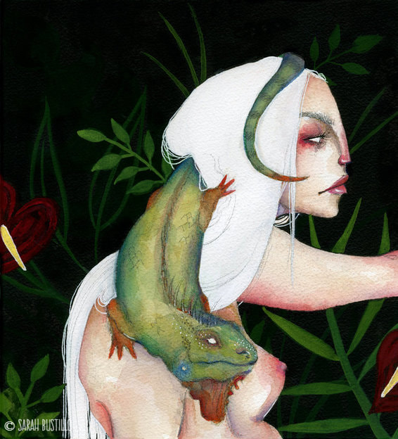
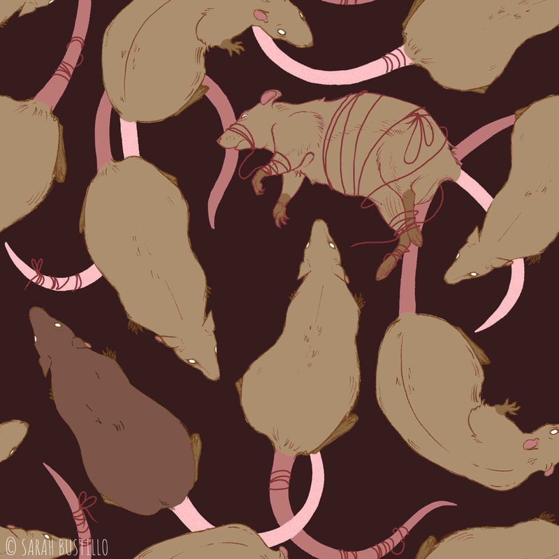
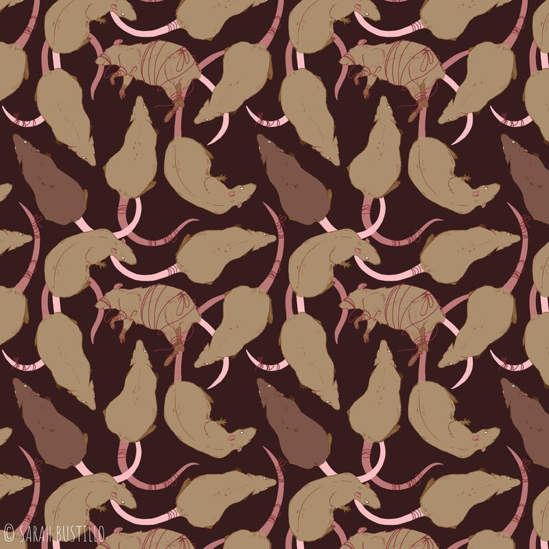
I began this piece with a little less planning than usual. I sketched out the face on a piece of scrap paper and reproduced it on my watercolor paper in pencil. As I continued to sketch out the other elements, I decided that I wanted to incorporate something reptilian as her companion. Because I had already drawn her head and torso, I sketched the iguana to morph around her so no big changes would have to be made. After sketching, I started with watercolor and worked my way outward from her face. After finishing all of the watercolor elements, I outlined everything with India ink pens and waterproof ink for the rest of the background. I then decided to use gouache to add some greenery to the background to give her an environment and to add some more color. As usual, I finished off with highlights and details using my favorite white ink pen. There are areas where my initial pencil sketch is peeking through. I was taught to avoid that when painting, but I do enjoy the look of it sometimes. For that reason, I didn't try to cover it up and instead added even more line work with my pencil. I feel that it helps to define smaller details without the harshness of ink. That's pretty much it for this one. If you have any questions about tips and materials, or for inquiries about purchasing this piece, please feel free to comment or email me! -Sarah Hello all! For this In Depth Process, I am going to go over the tools and materials I used to create my surface design pattern Rats. The process of making it an actual repeating pattern is a bit too long for me to cover here, so I'll mostly be going over the drawing portion. If you're interested in having a tutorial on that however, let me know in the comments below! MATERIALS:
The most difficult part of the process is figuring out how your drawing will line up enough to create a dynamic repeating pattern. However, after that, it's mostly drawing as usual. I began these drawings on paper with graphite pencils. I drew each rat separately so I could place them individually later on in Photoshop. After sketching, I lined the rats with ink pens and scanned them into my computer. In Photoshop, I separated the line work from the white background so I could color the lines any color I want. Again, I did this with each individual rat. Next, I painted in the rats main color under the line work and merged them so the line and paint were on one layer. It was then that I was able to move the individual rats onto one Photoshop file and play around with the positioning. I only drew and scanned in 3 rats total, but I was able to flip some of them around and tweak some details in Photoshop so I had more variety. The last step I did was painting the tails because the placement of those was really reliant on the positioning of the rats' bodies. That is how I painted the initial tile (left image) to create my pattern (right image). Again, if you are interested in a tutorial about the actual making of a pattern in Photoshop, please comment down below. Also, if you have any questions about tips and materials please feel free to comment or email me! -Sarah Hello all! Thank you for visiting my website. This is going to be my second In Depth Process for a landscape painting. I am going to go over the tools and materials I used to create this piece, Untitled Landscape 2. MATERIALS:
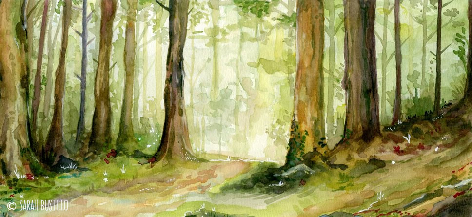
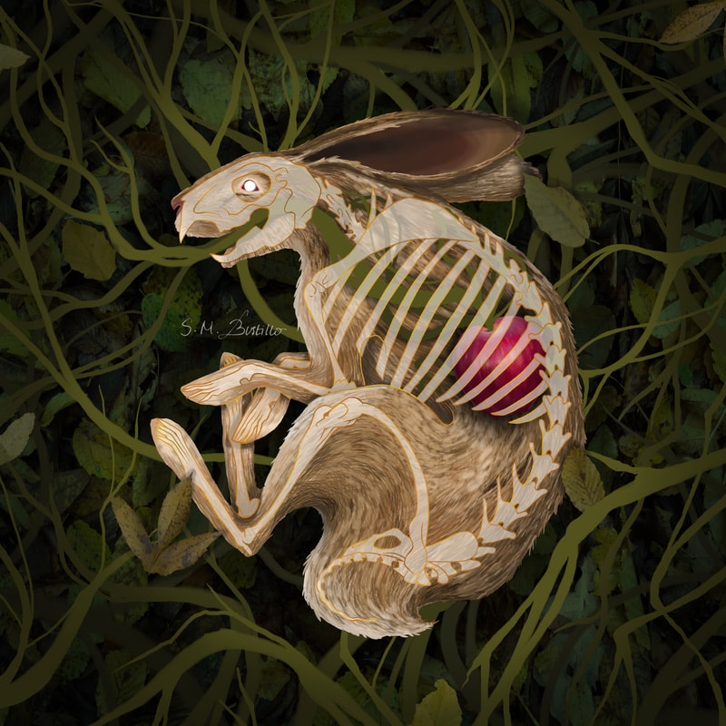
Just like Untitled Landscape 1 this piece measures 7" x 14" and is on Strathmore cold press watercolor paper. I used watercolor for the entirety of the painting, except for some small details that I made with a white ink pen. I put a little more detail into this painting than my previous landscape in terms of the amount of trees in the background. Just as before, I used the wet-on-wet method of watercolor painting and began with very light washes of color. I let the splashes and droplets that sometimes occur with watercolor be what define the shape of the trees. I have mentioned in the past that watercolor is my favorite medium for creating foliage, and that is still the case with this landscape painting. I painted from background to foreground, starting with light washes of color and adding more trees and bushes as I worked my way to the foreground. I find that I have some difficulty making my colors super pigmented especially with watercolor. I wanted darker darks than those that I had in my other landscape (it's all generally very light). For the darkest shadows of the trees I was very heavy handed with browns, blacks, and blues to get the desired darkness I wanted. I think that the execution of this landscape is more successful than the first. As always, I finished off with a white gel pen to add some small details and highlights. That pretty much concludes this IDP! If you have any questions about tips and materials, or for inquiries about purchasing this piece, please feel free to comment or email me! -Sarah Hello all! Thank you for visiting my website. If you're new here, welcome! This blog is where I go more in depth about the materials, techniques, and processes I use when creating my artwork. This IDP will focus on my painting titled Rabbit Heart based on the Florence + the Machine song. This was actually an assignment from one of my illustration courses where we designed album/CD covers. Florence + the Machine is one of my favorite bands, so it just felt right to make one based on them! MATERIALS:
I started this piece with a pencil drawing of the rabbit skeleton. The research portion was pretty difficult because skeleton anatomy is always more intricate and precise than flesh. I then went over my pencil line work with ink pens and scanned it into my computer. In Photoshop, I separated the line work from the background, and began painting the rabbit's body on a different layer. I had to mess around with the opacity of both layers to get them to a point where they didn't seem to clash with each other. On different layers I painted the apple, the color of the rabbit's bones, and the vines. I found a bunch of images of foliage that I could use for reuse with modification, and cut out portions that I liked best and compiled them together to make a large bush for the rabbit to lay in. On top of that I added a vignette and even more vines that I kept flat rather than rendered. Lastly, I played around with the line work for the skeleton because what I had initially picked wasn't standing out nicely. I made my own "gold" line work by mixing two shades of bronze into the one line layer. That's about it! It was definitely a much more exhausting process than those few paragraphs make it sound. Nevertheless, I love the final product! If you have any questions about tips and materials please feel free to comment or email me! -Sarah Hello all! Thank you for visiting my website. If you're new here, welcome! This blog is where I go more in depth about the materials, techniques, and processes I use when creating my artwork. This post will be about my portrait of Elizabeth Short, aka the Black Dahlia. I understand not everyone has an interest in true crime, but if you are interested and are not familiar with her murder I recommend giving it a quick Google search! MATERIALS:
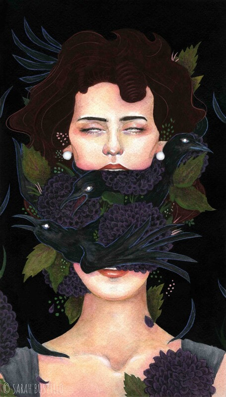
This painting measures 9"x15" and is on cold press watercolor paper. I sketched out everything with graphite, and began painting from her face outward with watercolor. When I was satisfied with the watercolor portion, I outlined everything with an india ink pen and painted the remainder of the background with waterproof india ink. After, I added highlights and detail using my white ink pen to add more interest. Now, I'm going to be honest. I had some issues with value contrast because of how black I wanted this painting to be. One of the reasons that Elizabeth Short was nicknamed the Black Dahlia was because of her black hair. I wanted her hair to be black, but I also wanted the background to be black. This is where I took some creative liberties and added a small amount of brown into her hair. In person, however, the contrast wasn't enough. This is where Photoshop comes in. Again, this is an optional step, but I wanted more contrast for me to consider this complete. So, I lightened up her hair and added a small amount of line work digitally to make it easier to discern her outline. There you have it! That is how I did my Black Dahlia portrait. I have more pieces that have digital elements (or are completely digital) that I will make blog posts about soon. If you have any questions about tips and materials, or for inquiries about purchasing this piece, please feel free to comment or email me! -Sarah
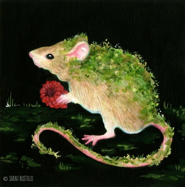
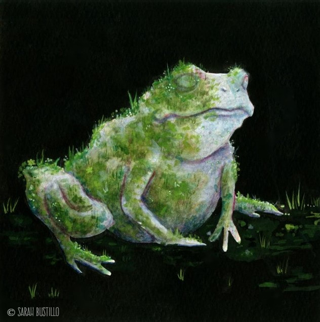
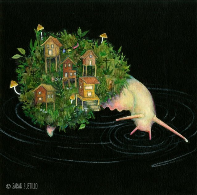
Hello all! Thank you for visiting my website. If you're new here, welcome! This blog is where I go more in depth about the materials, techniques, and processes I use when creating my artwork. I will be combining these three pieces into one post because 1) they are a series and 2) the process and materials are the same for all three. MATERIALS:
These three pieces measure 7"x 7" and are all done on cold press watercolor paper. The animals were all done in watercolor because, as I've said in previous IDPs, I find it easier to create foliage with. The only exception here might be he snail painting where I wanted more defined leaves as opposed to looser looking moss. For this, I defined the edges with some colored pencils. Just as I did with the painting Decay (Deer) I outlined the animals with an india ink pen and painted the remainder of the background with waterproof india ink. After, I added some texture and detail around the animals with gouache to help ground them. Finally, I ended with some tiny details using my favorite white ink pen to add more interest. That about sums it up for these three! If you have any questions about tips and materials, or for inquiries about purchasing this piece, please feel free to comment or email me! -Sarah |
AuthorSarah Bustillo is an illustrator from Los Angeles, CA. Her work delves into themes of femininity, death, and rebirth. She graduated from California State University Northridge in 2018 with a degree in Illustration and Anthropology. Archives
May 2020
Categories |
 RSS Feed
